Hi, I'm Christoph, the developer of compress-or-die.com.
I hereby ask you to accept the cookies
of the self-hosted Matomo Tracking software which I use to analyze the traffic to this website.
You can revoke your consent at any time on the following page: Privacy policy.
During an exchange with an illustrator about another article, he asked me why the JPEG format is so bad at handling the color red. As an explanation, I have already run across several variants. So I simply answered the questions with the variant that seemed most plausible to me.
But was that really the right answer? And if we knew the right answer.... then can't we do something about it?
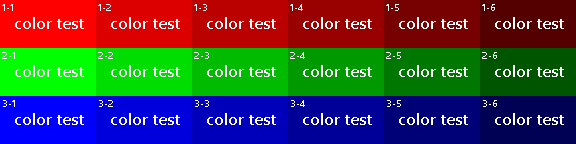
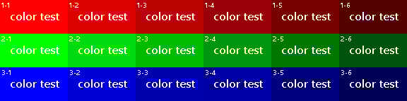
First of all, I created a test image to see in which cases artifacts are particularly noticeable. This test image is an image in the RGB color space, in which each line (1-*, 2-*, 3-*) contains only the color of one channel. Per line, however, in decreasingly strong intensities.
RGB source image
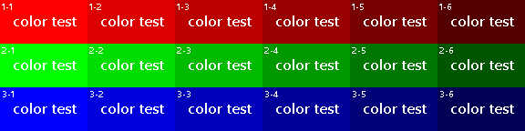
I then converted the image to a JPG with a quality of 50 (referring to the standard quantization tables from the JPEG specification).
At this quality, the image shows enough compression artifacts for an evaluation.
By the way, I set the chroma subsampling to 4:4:4 to get the most accurate color reproduction possible.
RGB-JPG with the default quantization table for a quality of 50 and a CHroma Subsampling 4:4:4.
The created image shows clear artifacts in the middle brightness levels for the red and green channels.
I can see practically no artifacts in the blue channel. I can also perceive the compression artifacts worse in the very bright and very dark areas.
Overall, I see even stronger artifacts in the green areas than in the red ones.
The best way to do this is to compare fields 1-2 and 2-2 as well as 1-5 and 2-5, where the image errors in the green channel are even more noticeable in my opinion.
It turns out that compression artifacts in JPEGs are thus not only very strong in red areas, but also in green ones. Was there any sleep in the creation of the JPEG algorithm? Has this really not been noticed?
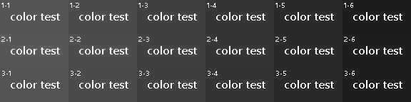
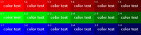
Since our eye can perceive differences in brightness much better than differences in color (we'll get to that in a moment), I once converted the pixels of the compressed image into grayscale pixels using the Average formula ((R+G+B)/3). This ensures that all color channels are treated equally:
Surprisingly, the compression artifacts are now equally evident in all three channels. The JPEG algorithm thus seems to treat the three color channels equally and not to favor or neglect any color.
So the fact that we perceive the artifacts differently must have something to do with our eye in some way.
Those who remember biology lessons in school may still know that the eye contains the so-called rods and the cones.
The rods are responsible for the perception of brightness. They are clearly superior in number to the cones and also much more sensitive than the latter. While the cones hardly perceive anything in low light, the rods are already hard at work. This is the reason why we can still orient ourselves well in very little light, but then perceive the colors only as gray (this fact, by the way, is the origin of the saying "All cats are gray at night").
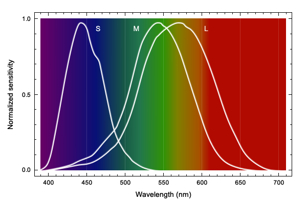
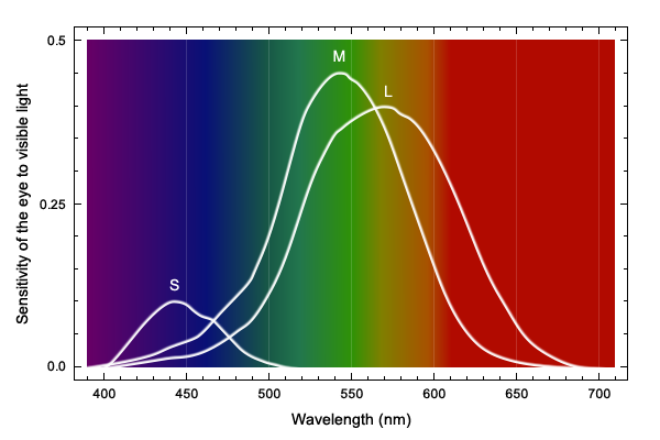
The more interesting sensory cells for us at the moment are the color-perceiving cones, of which there are three different ones.
The S cones (S for "short", i.e. short-wave light) react best to light of the wavelength of approx. 420nm and are therefore also called the blue receptors. They only make up about twelve percent of all cones. Therefore, we can perceive differences around the color blue relatively poorly.
The M cones (M for "medium", i.e. medium-wave light) have a soft spot for the light around 530nm. Their so-called absorption maximum is at the color green. They are therefore called green receptors. Since we should normally have a lot of green around us by nature (some youngsters rather less), it makes sense that we can recognize gradations in this color well.
Finally, we have the L cones (L for "long", or long wavelength light), which respond best to a greenish yellow with the maximum at about 560nm. These are also called red receptors because they also cover a large part of the perception of reddish light.
The L and M cones, with approximately the same quantitative distribution, together make up about 88% of all cones, which means that we can differentiate nuances in the light of these wavelengths very well. If we look at the following graph, which shows the sensitivity of the eye to visible light, taking into account the quantitative distribution of the cones, we can see that we can distinguish green, yellow and red very well, while we have perceptual weaknesses in the colors turquoise, blue and violet.
Red is a signal color, which is often used in images, e.g. in Eyecatchers, to which our eye is directed, and in which we can perceive the artifacts well on the mostly monochrome surface. Green, which we can perceive even better, is often found in natural objects such as plants or trees, which naturally have a lot of disturbed image details (high-frequency components), which is why the artifacts are lost in them.
Now that we know which colors our eye can see better, the question remains whether we can do anything about it. Theoretically, we should be able to apply more compression to the colors we can see poorly, and the other way around, we should be able to apply less compression to colors we can see very well.
Now a little background knowledge about the JPEG format helps again. This stores the image components in the YCbCr color space. The Y stands for the brightness, Cb for the chromaticity between blue and yellow, and Cr for the chromaticity between red and green. This conversion to the YCbCr color space is very useful because, as mentioned above, humans are better at recognizing brightness than color, which is why you can use different compression strengths for brightness and chromaticity. And on the other hand, because you can omit color information in the color channel (chroma subsampling).
RGB source image
Y channel
Cb channel (blue-yellow)
Cr channel (red-green)
The compression strength is defined in the JPEG algorithm by quantization tables.
And in most cases, two of these tables are embedded in JPGs:
One for brightness, i.e. the Y channel, and one for the two color channels.
But it's quite possible to embed different tables for the two color channels, although I've only seen this happen once before, when nonsensically the same quantization tables were used with the exact same values.
As a test, I once applied a weak compression for the Cr channel (Q 74) and a strong one for the Cb channel (Q 5) to the original image. The Y channel remained at a value of Q 50 as in the input example:
The new result: 16,118 Bytes
The old result: 16,214 Bytes
With even a slightly smaller file size, the new result has significantly fewer artifacts in the green and red fields, while only faintly visible artifacts have been added in the blue ones.
Using different quantization tables for the color channels can indeed make a difference, but this had yet to be confirmed with different source material, as we had only used a constructed test image so far:
The old result: 19,463 Bytes Source: Image by maniacvector on Freepik
The new result: 18,962 Bytes
The old result: 7,191 Bytes Source: Image from Sketchepedia on Freepik
The new result: 7,680 Bytes
The old result: 8,273 Bytes Source: Image by macrovector on Freepik
The new result: 8,118 Bytes
From these examples, where I tried to achieve a similar file size, you can see that you can certainly move the number of artifacts from the red color to the blue. However, in practice the benefit is minimal, because to achieve the same file size you have to increase the compression in the Cb channel enormously. A consequence can then be, for example, that the base color in blue areas changes strongly, because the DC component is simply changed too much at the high values of the quantization table. This can be observed very well in the background of the last image.
So it should only be worth it if the image suits you because of the color distribution, or if the image actually already looks acceptable, but you want to give the Cr channel a little more quality in exchange for file size.
If I have forgotten anything or even if something is wrong, I would be very happy to receive feedback so that I can correct the article if necessary.
If you always wanted to know how the JPEG compression works under the hood I want to recommend this article to you. It was important to me to write an article that is reasonable for every level of understanding.
Furthermore it contains 7 valuable tricks to reduce the file size of your JPEGs by exploiting the technical functionality of the JPEG compression algorithm.
Ever wondered why some of your PNGs are of large file size while similar PNGs are so small?
Since this question comes up so often, I have written a follow-up to my article "Understanding JPEG" to explain the bare necessities of the PNG compression algorithm in layman's terms.
At the end you will also get 7 tips on how to get your PNGs to a REALLY small file size.
You don't like ads? Support Compress-Or-Die and become a patron who does not see ads. Your upload limit gets doubled too!
News
COD says Goodbye
2026-06-24
After 10 years of compress-or-die.com, it’s time for me to say goodbye. It’s been a great time—I’ve learned a lot technically, but I’ve also met some wonderful people.
compress-or-die.com was created back then to get the most out of graphics for small banners. At the time, I was still working at an advertising agency. And over time, it just kept growing and growing.
But some of you may have noticed that over the past two years, there have been hardly any changes, and there hasn’t been much from me to read—which was quite different back in the day.
But a lot has changed in my personal life: children, new and different hobbies, and health issues have shifted my focus in other directions. And so, I had less and less time and motivation left for this project that was once so close to my heart.
For this reason, this chapter is now coming to an end. I’d like to thank all of you for using COD and for providing such great feedback, which helped COD grow so much.
I’d especially like to thank the Patrons who have covered the server costs over the past few years. Thank you so much!
On July 25, 2026, I will send COD into its well-deserved retirement.
All the best to you all,
Christoph
Check out our Reddit channel if you want to comment on the news.